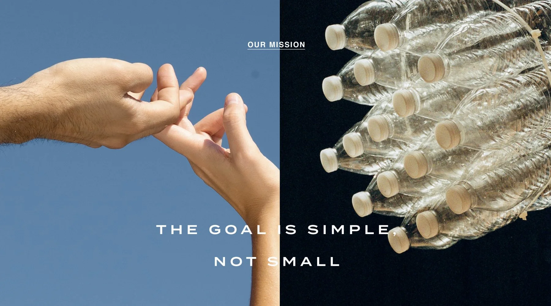
What does wellness look like when it’s rooted in ritual, equity, and ease? For MRNG, it looks like a brand that invites presence, honors intention, and makes space for healing — one morning at a time.
As an extension of a consulting firm focused on equity in the cannabis space, MRNG’s foundation was already purposeful. The task was to build a brand identity and ecosystem that communicated this ethos clearly: luxurious but grounded, minimalist but rich in meaning, elegant and inclusive. The name MRNG (pronounced “morning”) evokes a moment of pause and potential — that sacred space between rest and activation. We paired this idea with the tagline “Worth Waking Up For,” anchoring the brand in an ethos of intentional living and mindful self-care. MRNG launched with a CBD-infused offering that does more than nourish the skin — it nurtures a belief in better. With profits contributing to a capital venture fund for Black cannabis entrepreneurs and partnerships with minority- and women-owned businesses, the brand is rooted in regenerative practices at every level.
The visual identity mirrors this philosophy. Clean lines, a subdued earth-toned palette, and generous white space create a sense of calm and elegance. The logotype is modern and minimal, softened to feel human — a signal of care, not performance. Every detail, from the type hierarchy to the tactile packaging forms, was curated to give the MRNG Routine a spa-like serenity that can be carried into the everyday. Custom packaging design was developed to reflect the multi-use, genderless, and vegan nature of the products — clear in message, luxurious in feel, and easy to integrate into real routines. Across digital and print collateral, we expanded the system with organic textures and lifestyle imagery that honors all skin tones, all identities, and all expressions of beauty.
ProjectVisual Identity
Brand Development / Strategy
Brand Collateral Design
Packaging Design
Copywriting
MRNG
Purpose: craft or cause
ANMP DELIVERABLESCLIENTINDUSTRYCPG, Wellness